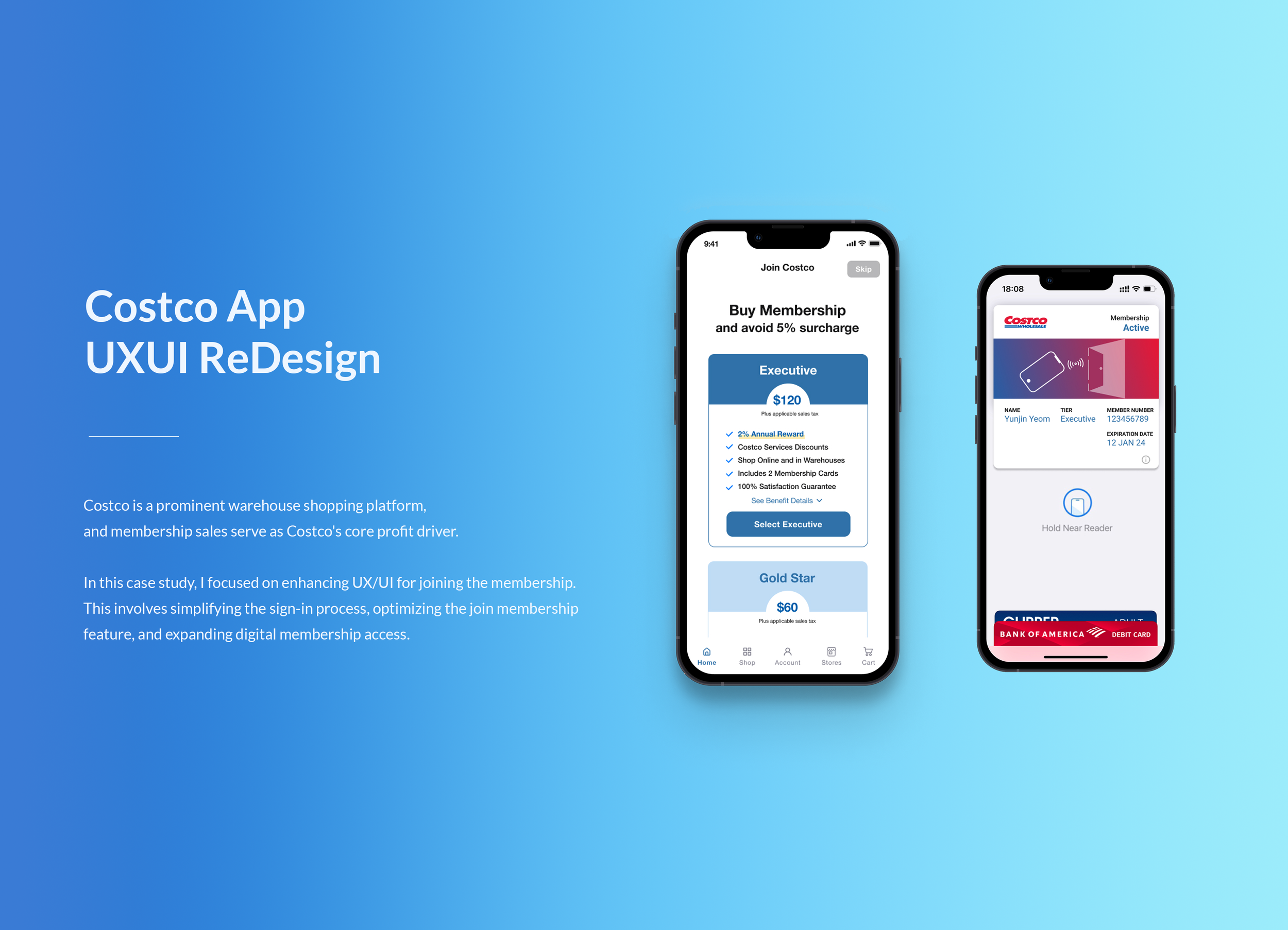
INTRODUCTION
The project goal was to enhance usability by optimizing the shopping journey, including membership management, item search, product listing, and checkout processes.
DURATION
Aug.-Nov. 2023 (3 months)
ADVISOR
Dr. Abbas Moallem
IMPACT
I led the process design of the Joining Costco Membership feature and managed the interface evaluation and usability testing by synthesizing data collection and analytics. As a result, we got the top score out of 10 teams.
CONTEXT
Costco is a membership-based warehouse club offering bulk products and diverse services. The mobile application provides many features, including product searching, membership management, shopping and check-out, member-only deals, and many other services.
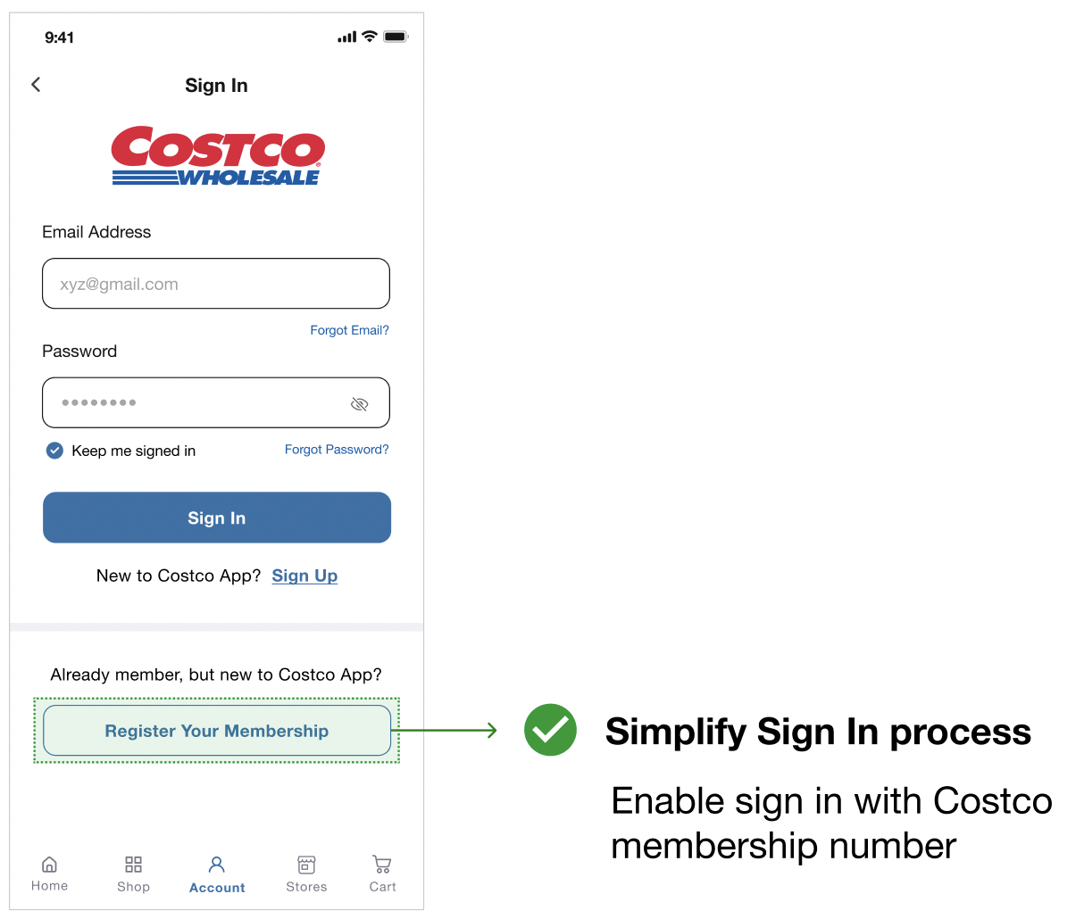
However, we decided to redesign the mobile app because app stores and Google Play store ratings and reviews highlighted usability issues like slow product listings, long shopping journeys, search functions, clunky user interfaces, and difficulty registering & accessing digital membership.
MY ROLE
Interface Evaluation
Interface Design
Usability Testing
Heuristic Analysis
TEAM
Manasa Hedge (Designer)
Nidhi Deshpande (Designer)
Yunjin Yeom (Designer)
TOOL
Figma
Lucid Chart
Google G-Suite
Zoom
USER PROBLEM
Users have difficulties using, locating, and identifying their Costco memberships on the mobile app.
We studied the Apple App Store and Google Play Store ratings and reviews to find users’ actual pain points and develop them into user problems. I found numerous complaints about its functionality, design, and poor user experience, immediately identifying areas for improvement.
WHY IS THIS A PROBLEM?
Costco membership is the biggest profit-making source for the business, and I wanted to focus on this point to leverage it for business growth. As a designer, it is important to listen to users’ opinions and their feedback. At the same time, I am hired by the business owner, so I thought it would be great to connect these two dots.
DESIGN CHALLENGE
"How can we encourage users to buy Costco membership
and freely access digital membership?”
PROCESS
USER FLOW
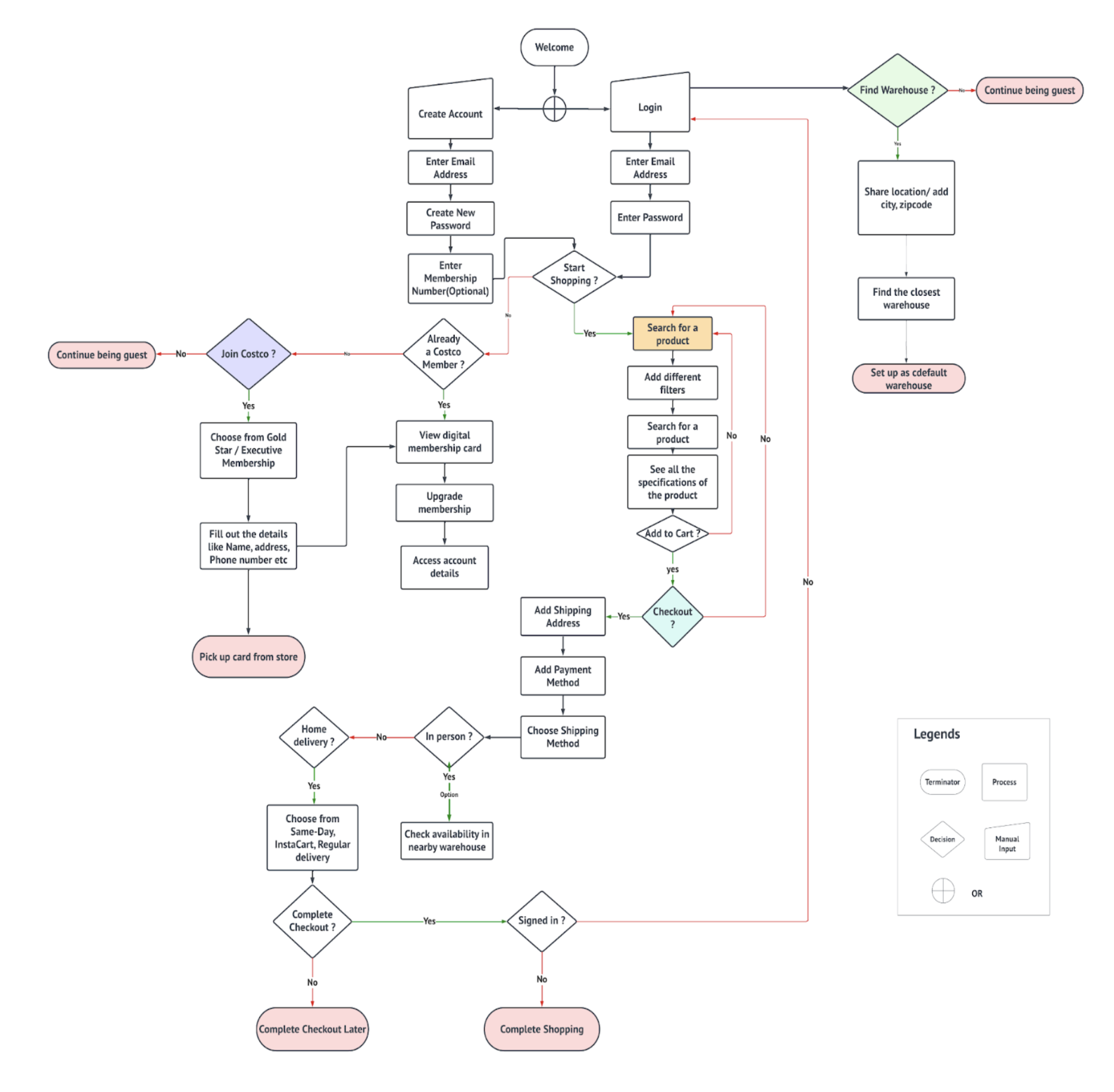
Before beginning the design process, we created a user flow to optimize the flow. This allowed us to identify problem areas, eliminate unnecessary steps, and pinpoint which screens require the most attention during the design phase.
INTERFACE EVALUATION - OVERALL APP
At this point, we wanted to apply design principles to find areas for improvement and determine the design problems. We learned Costco App needs to be redesigned that on this stage.
1. The Gestalt Proximity Law
The Gestalt Proximity Law, one of the fundamental principles of Gestalt psychology, posits that elements that are close to each other in space tend to be perceived as a group or a single unit.
In the context of a product listing scene, this law plays a significant role in how information is presented and perceived. This means that it organizes and presents information in such a way that users cannot easily perceive group patterns, relationships, and connections between various elements in the product listing.
2. Miller's Magic Law
Miller's Magic Law, also known as Miller's principle proposed by George A. Miller, suggests that the average human can hold about seven (plus or minus two) pieces of information in their working memory at once.
The picture shown here violates Miller's Magic Law by presenting an excessive number of options on the screen, potentially overwhelming users and making it challenging for them to arrive at a decision.
In the updated design, We aim to keep the number of items or options within the cognitive capacity to prevent information overload and maintain user comprehension.
Arranging items in a meaningful structure leads to quicker selection times and greater user satisfaction.
3. Text and Image Contrast
The Current Costco app’s same size and color for product script does not help customers where they should pay attention.
1. Readability: Current text and images discourage customers from scanning what they need to find, and where they should pay attention.
2. Accessibility: High contrast is crucial for accessibility. Customers encounter to find products, deals, and sales. However, ensuring a clear distinction between text and images improves the overall inclusivity of the design.
3. Focus and Attention: The current text and image layout do not directly contrast the viewer's attention to specific elements, making it difficult to convey the intended message. This is particularly important for marketing materials, where key information or calls to action should be prominent.
4. Hick's Law
Hick's Law (or the Hick-Hyman Law) states that the more stimuli (or choices) users face, the longer it will take them to make a decision.
The picture shown here violates the law, as we can see there are too many categories, deals or discounts, services, and membership information provided on one single page.
In the updated design, our goal is to simplify the design while adhering to the law, which would make it easier for the users to decide to buy the product or not.
SHOPPING JOURNEY INTERFACE EVALUATION - Membership and Checkout
Now, we wanted to focus on the shopping journey, including buying membership and the checkout process. We learned that the journey is too long and that it is hard to find where each feature is located.
COMPARATIVE STUDY
To further study what tasks should be improved, we conducted a comparative study about the pros and cons of other similar competitors’ types of wholesale or bulk items, such as BJ’s Wholesale, Sams’s Club, and Walmart.
✨ Key Takeaways
Enhanced Understanding
Identification of Patterns and Trends
Informed Decision-Making
PERSONA
We discovered precise demographic information such as the race, age, and education level of average US Costco shoppers, among other things, through research and study. This helped make user profiling and focus on who we have to target.
USABILITY METRICS
Usability metrics are essential to assess the effectiveness, efficiency, and user satisfaction with interactive systems and interfaces. These metrics would help in evaluating the usability of a product and identify areas for improvement. For redesigning, we have decided on the following metrics.
1. ⭐️ User Satisfaction
Gather qualitative feedback from users through open-ended questions or interviews to understand their satisfaction levels, pain points, and suggestions for improvement.
2. ⏰ Task Completion Time
Evaluate the time it takes for users to accomplish specific tasks. This metric helps assess the efficiency of the interface. For example, Click to complete membership, search for a product, and complete checkout.
3. ✅ Efficiency - Number of ‘steps’ or ‘clicks’
Fewer steps or clicks mean users can complete tasks more quickly, which is a key aspect of efficiency. Also, With fewer interactions, there are fewer opportunities for users to make mistakes.
USABILITY EVALUATION DATA BASED ON METRICS
1. ⭐️ User Satisfaction
Usability metrics are essential to assess the effectiveness, efficiency, and user satisfaction with interactive systems and interfaces. These metrics would help in evaluating the usability of a product and identify areas for improvement. For redesigning, we have decided on the following metrics.
USABILITY TESTING RESULTS
One of the most important aspects of the design process for me is constantly testing the design and iterating based on the feedback. So we tested low fidelity mockup to see if the user journey flow and interactions made sense before spending time moving them into higher fidelity. Giving the user assigned tasks, I asked people to walk through the app to give me their general impressions of the structure and content.
SO, WHAT’S CHANGED?
BRANDING
DEMO
WHAT I LEARNED…
📊 Thoughtful User Research Pays Off in the Design Phase.
Thoughtful and thorough user research significantly enhances the design process. By conducting in-depth customer and market research, we identified key customer preferences (largest profit drivers) and critical pain points (membership accessibility issues). These insights directly informed our design decisions, resulting in a solution that not only improved user experience but also supported business growth.
🔑 Simplification is Key to User-Centered Design
We prioritized reducing complexity and simplifying workflows to deliver a more intuitive feature design. Since Costco customers often have clear shopping goals, we focused on streamlining their journey, ensuring the design highlighted essential tasks and minimized friction. This clarity was reflected in our final deliverables.
💡 Key Takeaway:
By balancing user insights with business objectives, we were able to create a solution that improves both customer satisfaction and revenue potential.
More work…
Zoom Usability Testing
(UX Research, UI Evaluation)
Massive thanks to my wonderful teammates, Nidhi and Manasa! We have been through it together and made it!
Window Film Price Quote Estimator UX Design
(UX, Web)
Ikea Logo Redesign
(Graphic, Logo)


