Librería Nómada Logo Design
Client
Librería Nómada
Duration
April 21’
Role
Ideation, Design
Tool
Adobe Illustrator, Photoshop
About the client
Librería Nómada (Nomad Library)
Librería Nómada was founded in 2018 with a mission of improving reading accessibility at affordable prices in Mexican society as many of the population are not able to buy a book for the high price. Currently, they are seeking to make reading, knowledge, and growth more accessible to the community. They firmly believe that education begins at home and in Mexico.
Project Overview
The client charged this logo design project for 2 designers and I was one of them. So it was like a competition and I wanted to win, I wanted to nail it. Firstly, I interviewed the founder and researched how I should broaden my ideas. For me, a deep understanding of the brand and business philosophy had to be conducted in the first stage. Follow my lead on how I broadened this project.
Design Process
Understanding: Interviewing the founder
Research: to pull out keywords to ideate
Idea Sketch: Still my hands are quicker to express my ideas so I sketched various early-stage logos
Design: Hi-Fi design
Application Mock-up: To show how it will look like actually.
01 Interviewing the founder
First of all, I interviewed him to get to know about the company's mission since understanding the company has to be conducted prior to any other step.
After interviewing him, I finally got the design concepts and keywords.

Collecting images


I laid some keywords and pulled out two words ‘Book(Paper, Bookmark)’ and ‘Movement(Bird’s Flying')’ to design.

I collected book elements such as papers, bookmarks, and etc… to make design ideas


I came up with some idea that…
the book papers look like a bird’s wing
the bookmark line can be connected like the bird’s tail.
03 Idea Sketch


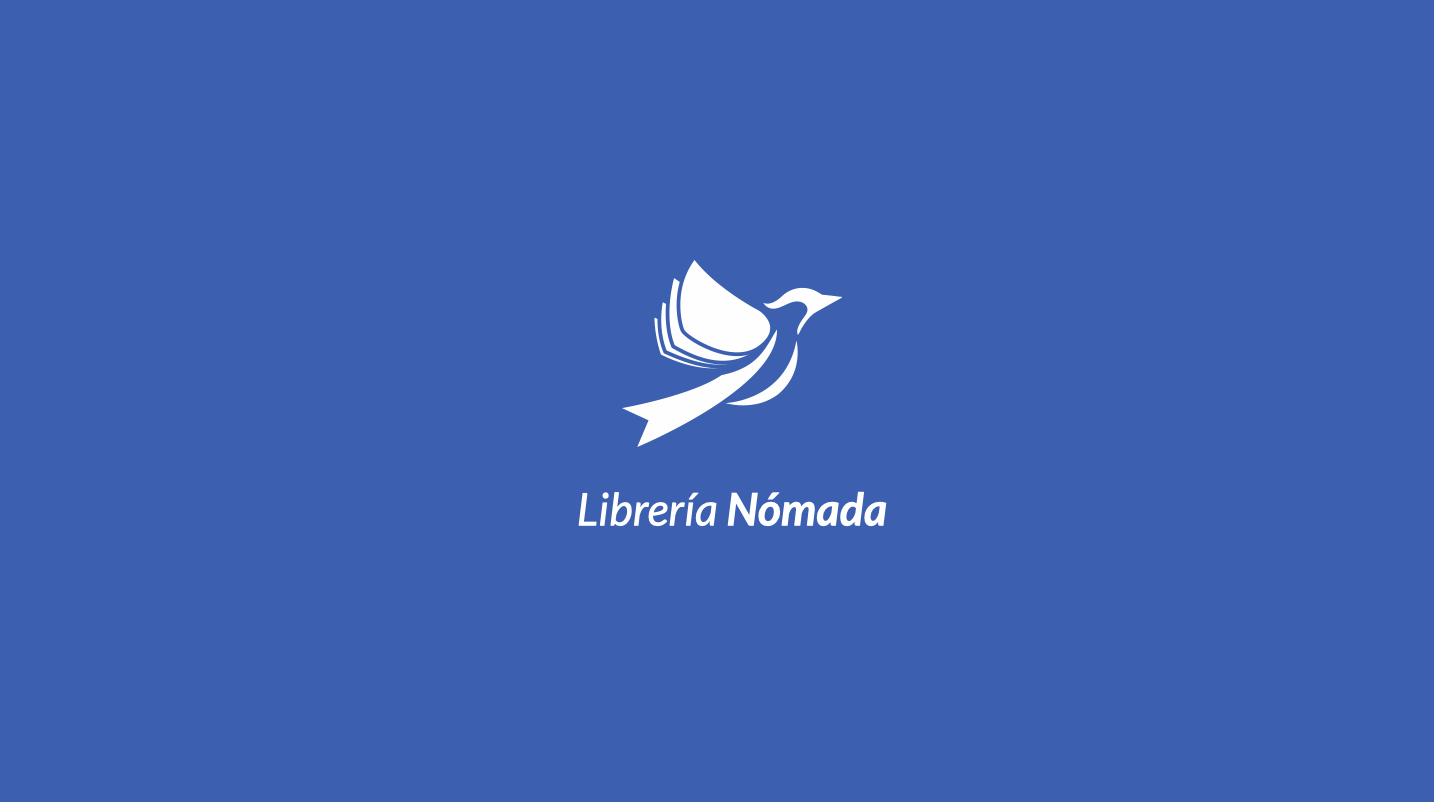
Through many sketches, I finally created a early logo design which is combined a bird and book elements(flying papers, book mark)
Final Ideation (Low-Fi Sketch)

Like the business mission, it has a meaning ‘Fly like a bird until you succeed with our books’
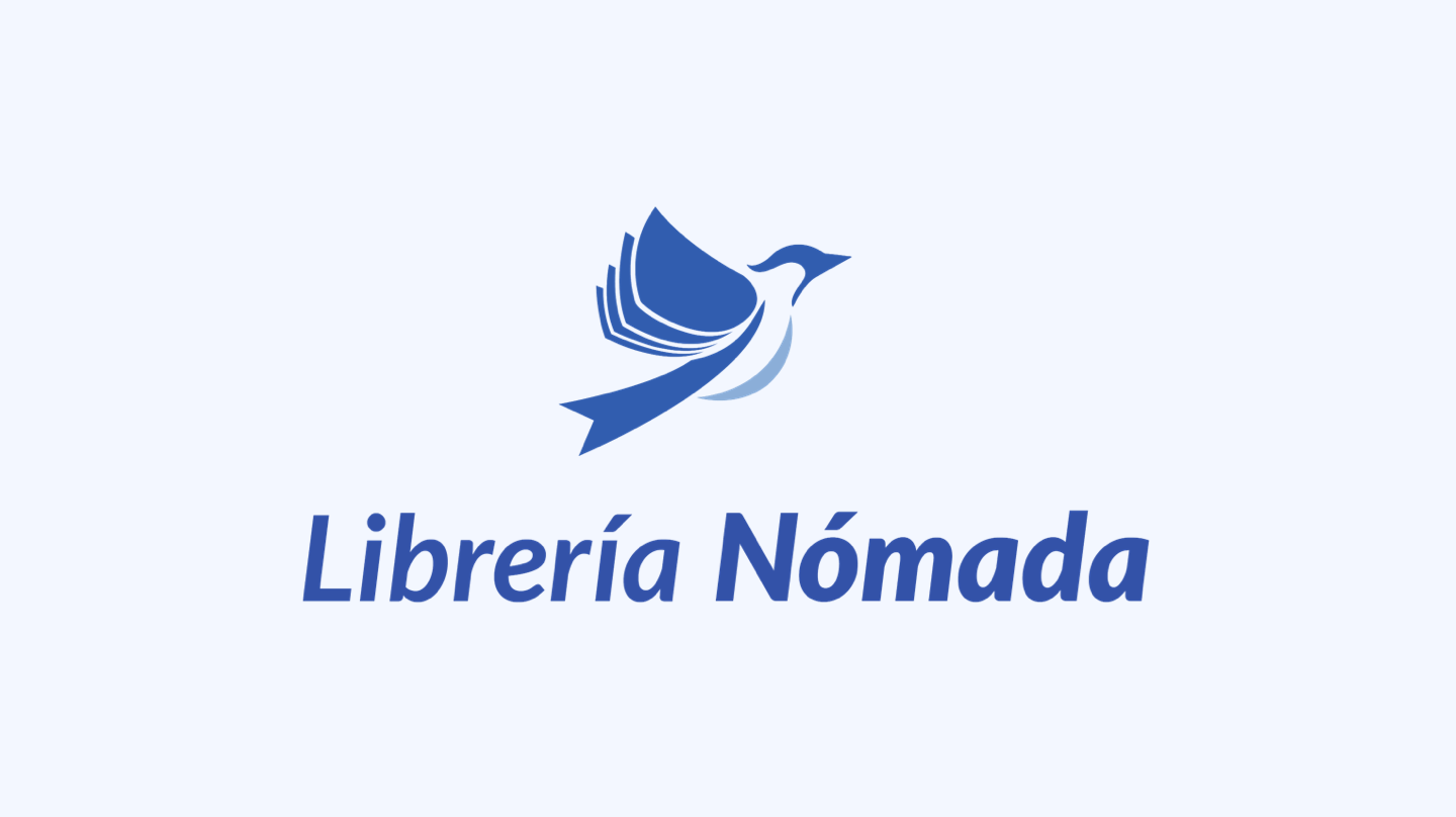
04 Outcome

I showed other serif font versions and different colors but the client liked this one for the following reasons…
The san serif font is more like the company’s style and has better readability from a distance.
2. Overall, the logo looks clean and goes well with the company’s mission.
So finally this was selected by the founder and other employees.
05 Application
Suggesting real applications to the client increases credibility, so I made some applications that are related to the bookshop the company can actually use.

Actual applied Free Shipping Banner on the official web

Mug
I heard that the client is planning of opening ‘cafeteria’ section in their book shop and he liked this idea.

QR Code Book Mark
So that customers can scan the QR code and access the official website.

Book Wrapping Paper
Gradually Mexico is restricting plastic book wrapping so I came up with the paper wrapping idea.

Shopping bags
The client liked that the bird’s wing looks more live and vivid with this type of logo as well.

Stationery

Window Signage

Eco bag

Branch locations map in Mexico
05 Reflection
What I learned from this project…
Sketch as much as you can
Actually, it can be applied to every type of design. For branding design and especially logo, it has to contain powerful meaning delivery in just a little graphic design so I struggled quite some times. However, I kept trying to connect its business mission and direction where it has to go and didn’t stop to sketch. Through many sketches, the final design just came out like a lightning all of sudden. I think the ideal outcome had been made itself little by little in my head unconsciously while I was sketching many ones and learned that I have to do pour as much time as I can if I want something.
More work…

Price Quote Estimator UX Design
(UX, Web)

Street Parking System UX Design
(UX, Mobile)

Ikea Logo Redesign
(Graphic, Logo)