Ikea Logo Redesign
Role
Research, Ideation, Design
Duration
May, 15’
Tool
Illustrator, Photoshop
Project Overview
IKEA designs and sells ready-to-assemble furniture.
Founded in Sweden in 1943, IKEA has been a global home furnishing brand that brings affordability, design, and comfort to people all over the world.
I thought that customers see always the assembly manual and it looks like ‘origami’ in terms of the step-by-step process and they can find joy when it’s complete. So I redesigned its logo with the dotted lines and folded papers that make people want to fold and assemble just by looking at it.
Research
Before I start, I researched the company to pull out some keywords and ideas.
Discover
Ikea is known for ‘ready-to-assemble furniture’ and I found that customers always use manuals to assemble it.
and I found that Ikea’s manual looks like origami in terms of that the customers have to follow step by step and they found joy in the assembly process.
Idea Sketch
So I redesigned its logo with the dotted lines and folded papers shapes that make people want to assemble IKEA's furniture just by looking at its logo.
I sketched the IKEA letters with some instruction lines where you can find them in an assembly or origami manual.
Design Principle
Black and White, only colors the manual uses.
Various Lines where customers find in the furniture manuals.
Early Design
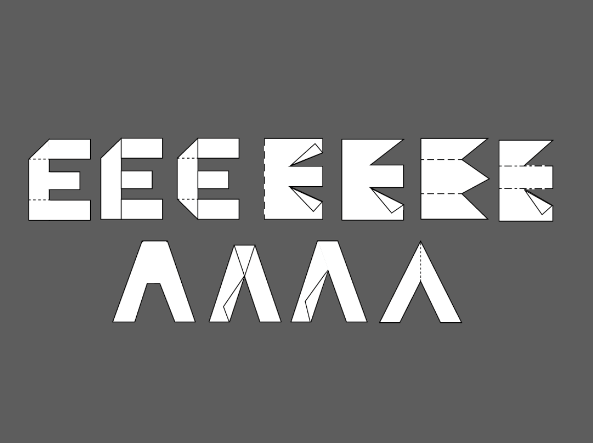
I started to assemble ‘I.K.E.A’ letters like origami with assembly manual instruction lines, paper folding, and dotted lines.
Attempting as many as possible…
I liked the folded paper ‘K’ letter
Definitely, folding and dot line looked great
Final Design
I tried to combine each different letter as many as possible and picked some of them to see which one is better.
Picked my favorite one!
Also I liked this combination
I realized it has a bit less readability
Application
I wanted to make some commercial AD application or catalog images to show the new logo
New logo with dotted lines represents that people can buy whatever furniture they want and find a joy in the assembly process with their family, friends, etc...
Applied shopping mall banner
Even in the terrace, Ikea brings a joy of assembly and decorate their home
More work…


