INTRODUCTION
The project goal was to understand how users perceive the interface in the Zoom desktop app and get insights on how we can improve the interface's usability.
DURATION
2 Months (Mar-May 2023)
ADVISOR
Dr. Anthony Andre
STUDY OBJECTIVES
Zoom has been the default videoconferencing method since the COVID-19 pandemic. Despite its prominence, Zoom lacks telemetry on its usage and has not conducted a comprehensive assessment of its usability. Therefore, our task was to explore the usability, discoverability, and use cases for Zoom’s diverse audience.
IMPACT
I contributed to the study design and managed the project by synthesizing data collection and analytics. As a result, we got the top score out of 8 teams.
WHAT ARE ZOOM’S MAJOR FEATURES THAT USERS MOST INTERACT WITH?
Our objective was to evaluate the efficacy of the Zoom meeting control features. We aimed to ascertain whether users can seamlessly navigate the app's key features to accomplish scenario-based tasks with minimal errors.
MY ROLE
Study Design
Interaction Mapping
Test Questionnaires
Data Collection & Analytics
Synthesis
TEAM
Yunjin Yeom (Designer, Researcher)
Anupriya Chakraborty (Product Manager)
Skye Mak (Researcher)
Denise Guevara (Engineer)
Swethasree Pendyala (Designer)
WHAT DID WE KEEP IN MIND WHEN DESIGNING THE STUDY?
1. Understanding different characteristics of writing tasks for Qunt & Qual studies: As this was a hybrid of quantitative and qualitative studies, I designed the tasks to be concrete and focused on capturing metrics, such as success or time on tasks. By doing so, participants were able to focus on their tasks and we facilitated capturing the metrics. At the same time, the ‘free play session’, which was the last step of the tasks, was open-ended, flexible, and exploratory so we could get a better understanding of user insights and pain points.
2. Designing realistic tasks only: When writing, I looked at what users need to do with Zoon for inspiration for the tasks. It was important to remember that tasks must be as realistic as possible because we wouldn’t want to force participants to do something they wouldn’t do in real life, or we would measure something that’s irrelevant to the project.
3. Avoid giving any clues: We didn’t describe the exact steps users need to take — we let them figure it out on their own because it could lead to biased results. We avoided prime participants to look for a specific word. For example, we gave instructions like ‘Start the meeting’, instead of ‘Start the
4. Keep tasks emotionally neutral: As we wanted the best and not biased results, we avoided making assumptions about the user’s personal life or relationships when writing tasks. All words were neutrally selected, avoiding any that could emotionally provoke biased backgrounds. For example, we asked them, ‘Imagine you’re having a Zoom meeting with your classmates or colleagues, instead of ‘mother’ or ‘siblings’.
5. Always pilot test your tasks: This is a critical step that far too many researchers skip. You may think your tasks will work well, but you never know until you try them out with one or two representative users. Planning for a pilot in your study budget and schedule greatly helped us to save our project from wasting resources by accidentally using a bad task and from getting bad data.
PROCESS
INTERACTION MAPPING
I created an interaction map to gain a solid understanding of user behavior and system functionality. The focus was on how users interact with the system, identifying their pain points, confusion, or frustration. Interaction mapping helped us comprehend comprehensive user flows. It allowed us to pinpoint where interactions occur in the user journey and identify noticeable errors.
TASK FLOWS
In order to delve deeper into tasks we want to study further, we identified the main 6 tasks and mapped out the user task flow.
Schedule meeting.
Inviting others to join a meeting while in the meeting.
Screen sharing.
Create meeting breakout rooms.
Whiteboards.
Reassigning the host.
TASK PERSONAS
At this point, we tried to identify and group the main tasks we wanted to focus our research on further. I created ‘task personas’ to accomplish this, giving our research an organized framework.
We mapped out their:
Demographic
Empathetic needs (I want to)
Goals (So that I)
Pain points (What’s holding them back?)
Key insights
RECRUIT PARTICIPANTS
Zoom’s target audience is highly diverse. We understand that there are many different backgrounds to try and replicate the variety of real-life users. For this study, 12 participants were recruited. The participants were divided into groups of novice users, who are defined as using Zoom less than once a month, and intermediate users, who use Zoom at least once a week. To scope the project to a maintainable size, our team adhered to the following criteria:
To take control of the protocol effectively and avoid hassles, we managed the system by utilizing a screener form, grouping novice & intermediate users based on the questionnaire results, sending notification emails & messages to the participants, and receiving documents (e.g., consent form) in advance.
Questionnaire: Screener
We assessed participants’ demographics, frequency, and usage habits.
Response data: 19 potential participants
Recruitment Messaging
We recruited participants by email. flyers, and online recruiting platforms
PILOT STUDY
We conducted a quick pilot study, just as we would conduct the actual test. This allowed us to uncover potential issues ahead of time and gave us multiple opportunities to revise the study protocol.
🌟🎩 From this step, I learned one of the biggest insights: Always pilot study your tasks. This was a critical step that far too many researchers skip. You may think your tasks will work well, but you never know until you try them out with one or two representative users. Planning for a pilot in your study budget and schedule greatly helped us to save our project from wasting resources by accidentally using a bad task and from getting bad data.
METRICS
1. Performance measures: Quantitative measures that asses Zoom’s ease of use and efficiency.
⏰ Task completion time
🧐 Required assistance
2. Behavioral measures: Used to gain verbal & non-verbal data that map to study objectives.
😶 Facial expressions
🤷♀️ Body language
🗣 Verbal comments
3. Subjective measures: Generated insights from participants’ self-reported data to understand user’s intentions & opinions.
📊 Difficulty level
📈 Confidence level
METHODS: Study flow
METHODS: Documentation
Consent Form
Compensation Receipt Form
Likert Scales
METHODS: Camera Angles & Equipment
We were aware of that capturing the data was important and wanted to record participants’ behavioral expressions. So we installed the cameras with supportive equipment.
3 Total Cameras
1 to capture participants’ facial expressions
1 capture screen from behind the participant
1 was recording the screen via a screen recording app on PC
Other equipment used
Tripod
2 Laptops & chargers
Water bottle as iPhone stand
KEY FINDINGS
1. Screen (+Sound) Sharing: Most Time Consuming & Lowest Confidence Level
: This took the longest to complete and had the lowest confidence level.
“I had difficulties with sharing sound of the tab. The location of share sound icon was a little bit difficult to find.”
- Participant 3 (novice)
2. Participants struggled with high information density
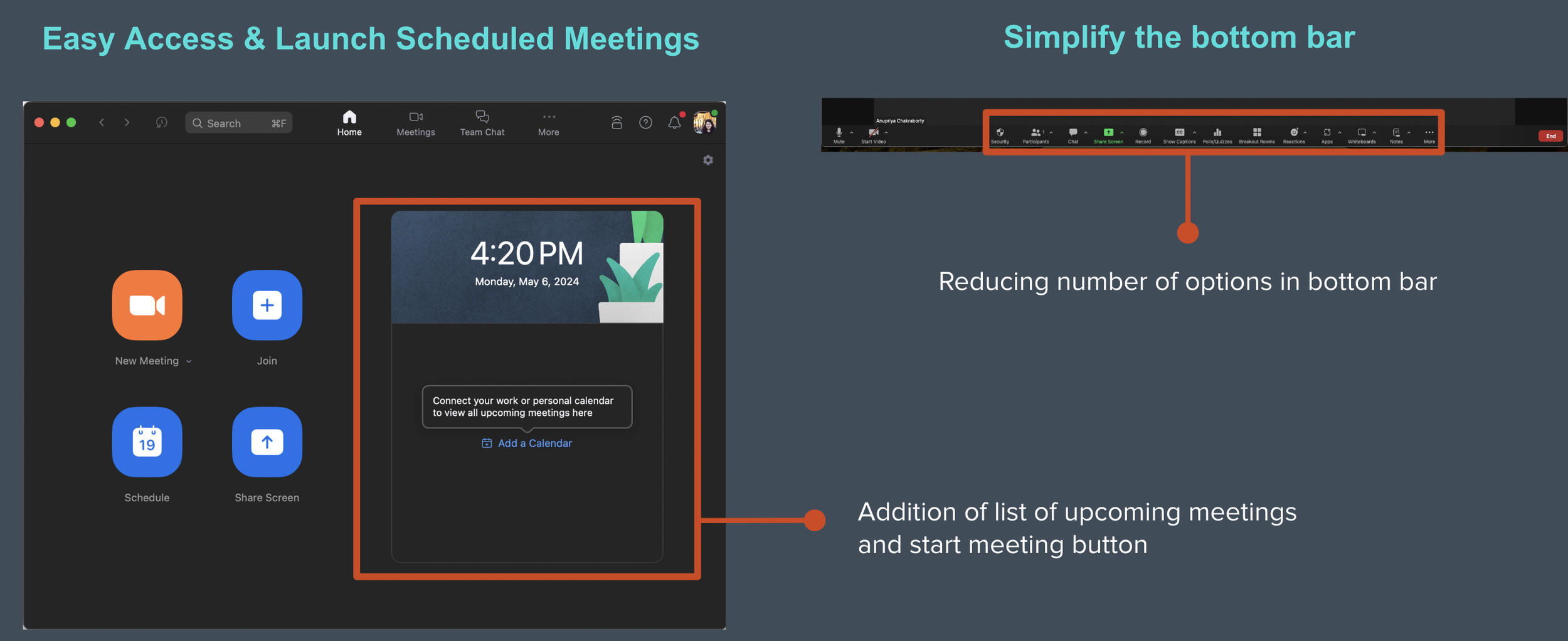
: The abundance of icons and features, with a lack of clear hierarchy, made it difficult for users to find the desired functions, likely increasing their cognitive load.
“After seeing a lot of options, I was confused. Some options weren’t pretty straight forward. I had to figure it out on my own.”
- Participant 7 (intermediate)
“I prefer Google Meet's interface. It keeps the main features neatly organized at the bottom, while Zoom displays all options on the screen, which can be overwhelming”
- Participant 9 (intermediate)
3. Inviting others while in meeting (send meeting link)
: Participants were completely lost and unable to figure out how to do it.
“It took me a while to invite others because there isn’t any active icon to invite participants or share.”
- Participant 5 (novice)
MAJOR PROBLEMS
We found that there are four major problems (screen sharing, navigating meeting controls, inviting others, and scheduling a meeting) and decided to develop them into insights.
INSIGHTS
Many people might merely present the numbers from user research, which are findings; they tell you 'what' but not 'why.' In contrast, we extracted valuable insights from the data and checked whether they met the user needs.
Reducing intermediate steps
Participants didn’t understand why they had to hit the ‘Open Zoom’ again when they had already clicked the launch meeting.
Recommendations
2. Offer a guided onboarding experience or readily searchable help to individuals who are unfamiliar with Zoom’s features.
Provide more obvious cues so users can find crucial features like "Done" and others. Think about redesigning the bottom meeting controls UI overall with information hierarchy in mind.
1. Shorten the visual distance
Provide more obvious cues so users can find crucial features like "Done" and others. Think about redesigning the bottom meeting controls UI overall with information hierarchy in mind.
3. Improve discoverability for add-on features.
The Customize, Themes, and Settings interfaces should have some of their overlapping features removed. Users will find navigation easier as a result, as they will be able to mentally map out which features are available where.
WHAT I LEARNED
✅ Findings are not insights. Presenting raw data in reports and presentations wasn't enough. After conducting usability testing, I realized several mistakes I had made. "I should have collected insights, not just data," "I should have presented how persona information would be used for the study design," and more. Now I understand the importance of collecting data, interpreting it to identify user needs.
✅ Average ratings often fell on the neutral point; no participant gave that number. I realized that these ratings don’t accurately reflect the true usability issues. Instead, I learned that verbal ratings, combined with a visual copy and asking good open-ended questions like “How would you rate the product?"(neutral), and "Can you walk me through your thought process here?" are far more effective to get further details. This actually helped me a lot on my group project usability testing day. Learning to move beyond subjective ratings was the true gem of this study.


