Window Film Price Quote Estimator UX Design
CLIENT
Tecno Productos Azteca S.A de C.V.
DURATION
July - September 2021 (2 months)
MY ROLE
Product Designer
TOOL
Sketch, Velo (JS code)
Project Overview
Context
Tecno Productos Azteca S.A. de C.V. is a window film distribution company for architectural and automotive glass based in Mexico. The biggest customer problem was ‘Customers want to know a desired window film price and information quickly & easily.’ and business constraint was ‘But the company owner refuses to reveal the price on the web even though he knows that it is the customers’ major interest. The project goal was redesigning its website to intrigue new customers and increase sales because the unhelpful current website led to low sales and it worsened with the digitalization trends spurred by COVID19. I was the only product designer and worked with all departments (customer service, sales, founders) to gather ideas and test usability constantly.
You might ask ‘what the heck is ‘window film’? here is a quick information view
Customer Problem
Customers want to know the window film price and information quickly & easily.
Challenge:
So, I was working as a commercial manager at the company and knew the sales decrease was because of the price matter and it’s related to the ‘price quotation’ process. I thought that there was an opportunity where I can recover the sales if I redesign the web as a breakthrough in order to intrigue new customers.
“How might we help the customers to get the price and product information
they want, at the right time, not sharing the price on the web?”
Outcome
What I’ve brought to customers and businesses:
Solution
Price Quote Estimator
It can be frustrating that customers can’t check the product price and information they want on the web and many of them lose their interest and drop off in the process of the price quote. However, the company can solve it by pricing it personally, if the process is simple and we encourage them to fill out the form. So I came up with three important design principles for the price quote estimator:
Now let’s dive deeper into the process of how I uncovered the problem and designed the solution to bring these outcomes.
Process
Design Approach
Research
User Research Overview
What did I need to learn from carrying out the research?
Research Goal
Understand why various target users access the TPA website for what purpose, therefore uncover opportunities to build an effective and practical sales mechanism.
Research Objectives
1. Identify difficult and inconvenient customer experiences and problems during the product browsing process in the current website system.
2. Learn from what process they are suffering specific problems and where the user leakage happens.
3. Uncover what function/feature each type of user cares about and why.
Used Methods
Inquiry message Inbox Review
To study what their specific major needs were and why.
Website Analysis
To deeply understand visitors’ needs and where I have to reconstruct.
1:1 Target Customer Interview
To uncover where they are dissatisfied and where to improve.
Inquiry Message Inbox Review
Uncover what the users want to know and why.
Through this review, I got a precious research result that ‘price’ is the customers’ major interest
User Research - Website Analysis
Learn from what process they are suffering specific problems and where the user leakage happens.
I learned that ‘visitors want to know where they can find the purchasing info’ from this step, this helped me to broaden some ideas for making a design solution.
1:1 Target Customer Interview
Through this interview, I wanted to identify difficult and inconvenient customer experiences and problems during the product browsing process in the current website system.
Result
01. Target customers’ usability issues
Most of the pages are out of data (TDS, Product Info, Models, etc...) and their links are broken/missing.
It’s frustrating that you have to contact other shops to buy the product.
Almost all information (model, product, where to buy) is not clear so that it leads to the target customer closing or leaving the website.
02. Where/how can be improved? Reconstructing Product information Architecture and pages.
Analysis
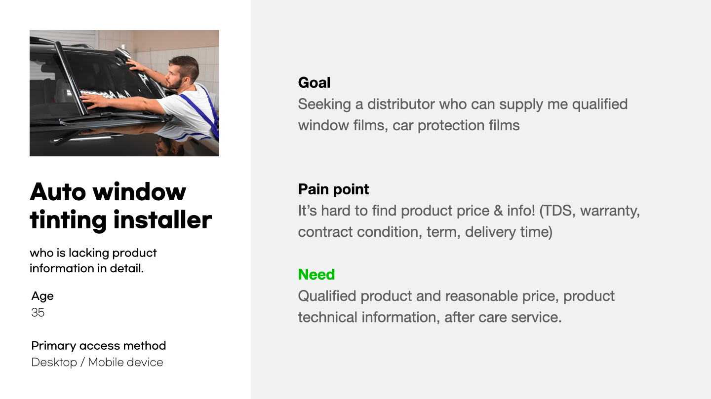
Personas
I interviewed 9 target customers and identified 3 personas with different consumption habits to define their goals, pain points, and needs.
Key Findings
I learned what the customers’ needs & goals are and got some insights that will guide the designs:
Customer Pain Points
I synthesized the user research results and usability issues and summarized them as two points.
The unrevealed price was a major interest for customers.
Customers have shown that they tend to be precautious to avoid quality issues and figuring out the price range.
Customers have trouble finding where & how to buy.
It makes customers call the office and wander around untill they purchase what they want.

Business Goals & KPI
Before I started, I wanted to set them up clearly to measure the project's success.
1. Make the customers stay and increase sales.
In the 1:1 target customer interview, it is revealed that they are likely to remain on the web when they are able to get what they need. It can stop customer leakage and lead to boosted sales.
KPI: Comparing Before & After of ‘Average site session duration’ and ‘New customer rate' from the website.
2. Reduce customer support cost & time.
Through interviewing customer service department colleagues, it is shown that they spend most of their time struggling with answering general questions and sending technical data sheets to customers routinely like a robot.
KPI: Comparing before and after of the incoming quantity of general inquiry emails and calls from customers.
Design Principles
Developing the website based on these three principles will help customers continue their purchasing journey.
Help customers choose exactly what they want.
Compare with the competitors’ products.
Guide complex product lists and types.
Ideation
Quick quote lo-fi wireframe
I created this to see how I can improve the price quotation process by making it quicker for the customers as well as see how helpful it would be for the customer service team to make a quotation. One of the biggest challenges I had was figuring out how we can encourage customers to complete the form and how we can suggest the exact window film that they want. These questions were vital to keeping the customers on the website so they can price the product they want. So, I specified the product types and applications in a simple and hassle-free way, and I designed “encouragement flags” to show why these questions are important to quote.
I designed it to show why the customers have to choose each item and why they are important for the price quote so that the outcome can be reasonable for them, rather than being just click-click-click steps without context.
Money can be a sensitive subject, so asking for their budget may be too direct.
Since we suggest the quote, I made a step where they can choose their expected product & its quality level.
In this step, we can receive who they are and identify them to give an appropriate quotation.
After finishing the quote steps, I laid two following steps - ‘Ask for samples’ and ‘Book a meeting’, which customers are most interested in after receiving the price quotation.
Prototype
Price quote estimator
After reviewing the lo-fi wireframes, I reflected on some feedback I received from the target customers and team members and translated finalized flows and details into the prototype.
Information Architecture
Since the customer research showed that they had difficulties in terms of finding menus and products when they are on the web, I thought Information architecture should be reconstructed so that it is more intuitive and easy to find what they need directly.
Old IA (Before)
Generally, the contents were here and there and it was hard to find the user’s desirable information.
New IA(After)
So I reconstructed it to help the users can find the information they need and see the contents at a glance, it makes the users spend less time and effort searching for information and are successful in finding what they need.
Validation
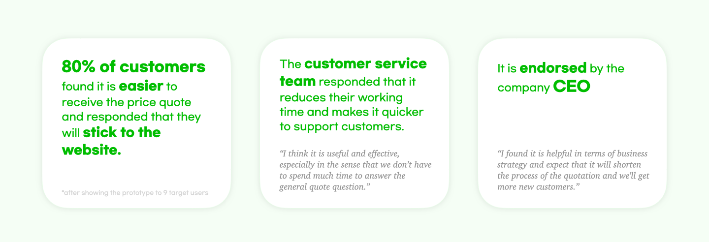
I conducted validation testing of the web prototyping with 9 target customers and the customer service team and summarized the result.
Reflection
This was a UX project for the company I’ve been working for the last 3 years as a commercial manager. To describe the outcome, I pitched this design solution to all the team members and the CEO. They liked the idea and I was tasked with designing the website. Through the whole design experience, I learned that solving the UX problem has to be conducted with a deep understanding of the User & Business problem first. I’d like to describe a little bit of the key points I don't want to forget.
Always ask yourself ‘WHY’: I learned that I can’t survive without my own thought process and I started to enjoy it!
Finding a design solution between ‘Business Constraint’ and ‘Customer Problem’ is not easy but totally worth it: I was struggling a lot in the early stage because I felt like I would never solve it…but I tried to find a way I could make as much as possible, I was able to reach the best version of it I could have done.
Setting KPIs/Metrics are important: It was a real-business-world-work, so ‘how I set out the success of the project’ and ‘whether it is successful’ have to be shown. I'm still working on revamping the website and will measure the result based on the KPIs. I learned that I might be failing, but it's okay as long as I can be critical of my work, figure out what was wrong, and know what I can improve for next time.
More works…


